I recently dug through old files and found some design school gems. Back in 2002, I was in my senior year at Kent and absolutely in love with the style of David Carson and the like. My design professors (hi John, Charles, David and Chris!), on the other hand, were fans of minimal, organized Swiss Design.
Working on this project, a poster for the school’s graduate program, I spent a lot of time foraging for paint scraps, dust and old xerox copies (looking at you, Kinko’s) and painstakingly scanned it all in, along with some (not very good) handwritten typography.
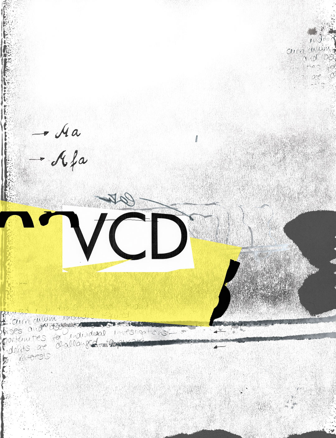
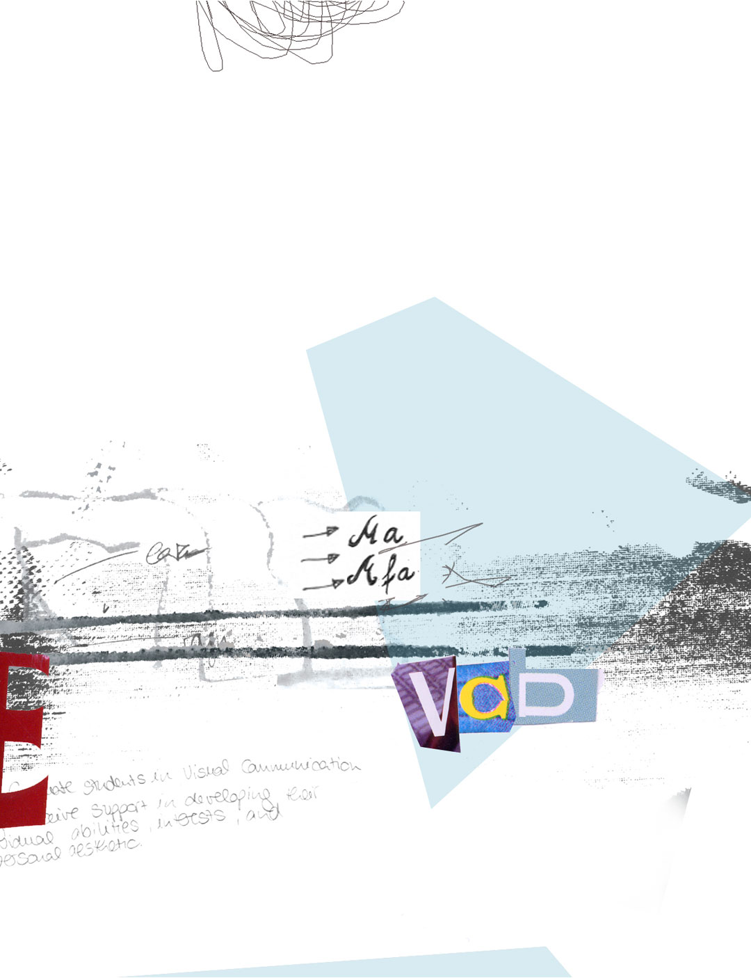
Unfortunately, I didn’t get far with the layouts because my professor took one look at them and said “That’s not design. That’s illustration!” and I went back and tried to keep some of the messiness while at the same time fulfilling the requirements of the class:
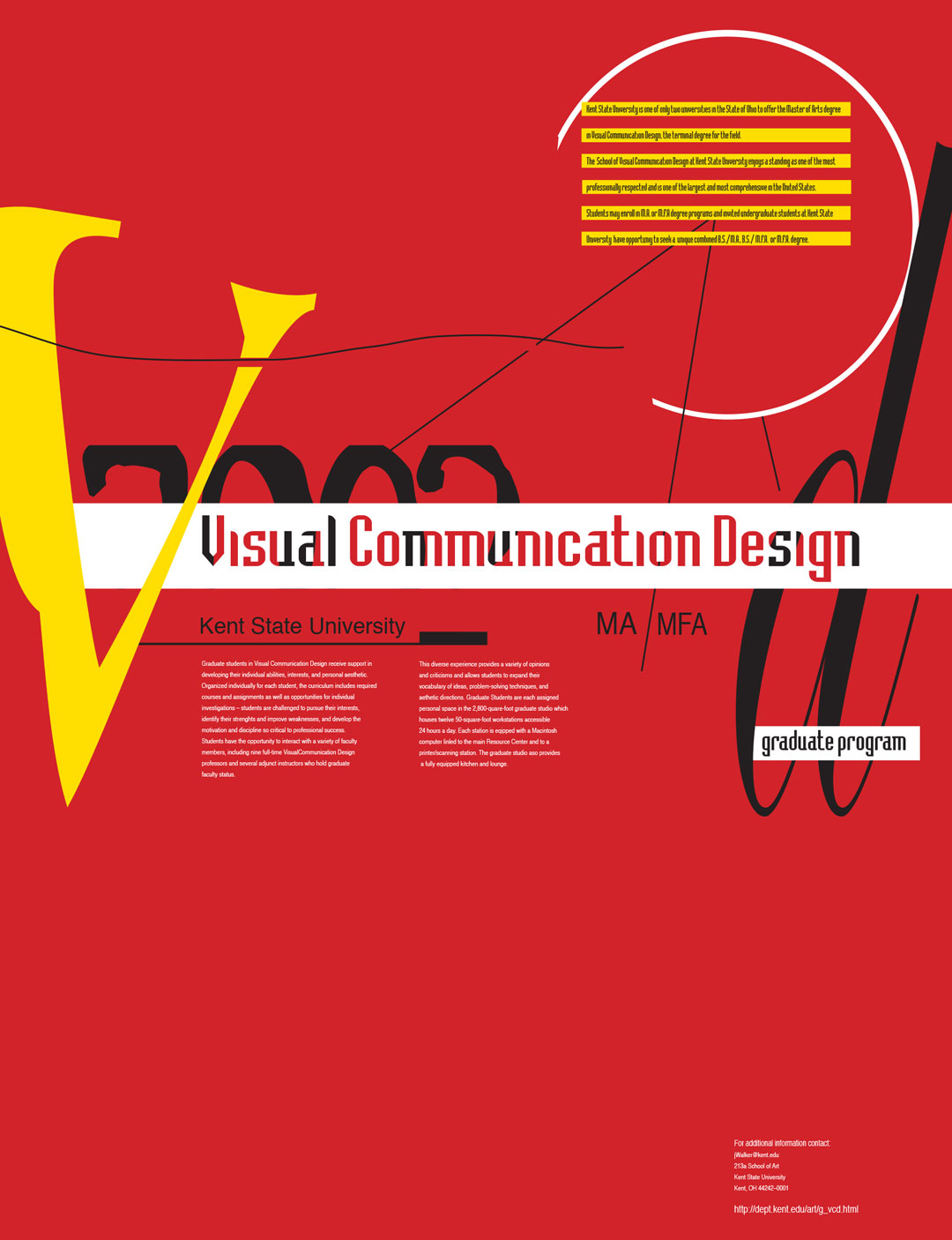
I was surprised to discover these layouts again because they still come so close to the style that I work in now and that I love, still.
The moral of the story obviously is not to listen to your professors. Ha! No, in reality they taught me wonderful things and what I’m happy about is that back then I was already defining my own design aesthetic and did what I am good at: Blurring the lines between illustration and design.
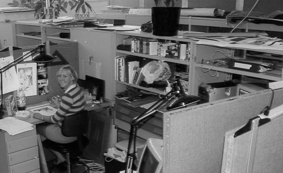
And just for shits and giggles here’s a picture of me, the hard-working student, around that same time, slaving away in the studio.